Praxis Clinical
branding | educational product development | medical illustration
The Client
Praxis was a medical clinical skills education company, subcontracted by universities and government agencies to provide highly specialized patient-centric and patient-empowering education to doctors, nurses, and students training to enter those fields. They also provided training and education to non-medical professionals with a range of backgrounds and education levels.

The Problem
The client was beginning to expand their teaching offerings and work with bigger, higher ranked universities (including within the Ivy League) and realized they needed materials whose quality matched that of their teaching—helping them look more professional and expert in the eyes of their expanding client base. Though they were experts in clinical education and community facilitation, they had no idea how to visually present themselves which made much of their offerings look wildly unprofessional.
My Role
I came onboard to refine their logo and branding basics—business cards, initial marketing materials—and, as they expanded their offerings, to provide medical illustrations in line with their branding to create an elevated, cohesive, on-brand course experience.
The biggest constraint came with the medical illustrations. The illustrations needed to be accurate and robust enough to use to train doctors and nurses at top institutions and within the US government, but accessible and understandable so they could also be used with community laypeople.
The Solution
Praxis needed a barebones brand refinement—given the nature of their business they didn’t need to constantly be creating new marketing materials, but rather have some branding basics (responsive logo, colours, fonts) and a few pieces to introduce and educate potential new clients (most marketing was done via their network, so they didn’t need to constantly produce graphics for digital and social advertising). The majority of their budget needed to go towards improving what they had, NOT towards creating robust guidelines to support them consistently producing new materials.
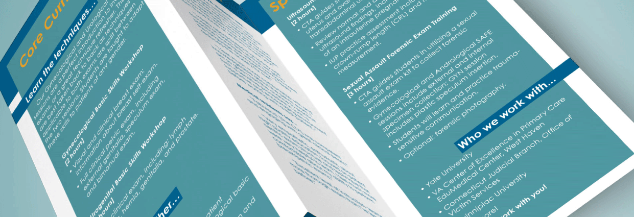
Reworking their promotional materials, including brochures.
The medical illustrations were in the same vein—they had functioning curricula with supporting illustrations that served their purpose in the company’s early days, but the combination of photos and excessively-information-heavy graphics were not only disparate from each other, but didn’t serve the company’s mission of accessible education and patient empowerment. My new illustrations needed to pare down the information from their original illustrations to what was medically accurate, educationally robust, but not overwhelming.
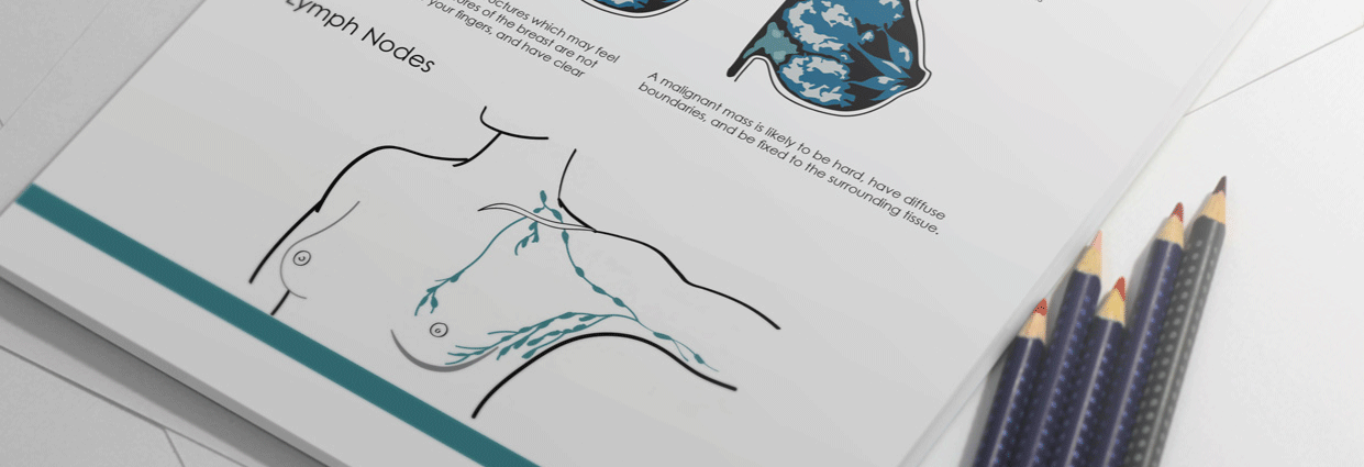
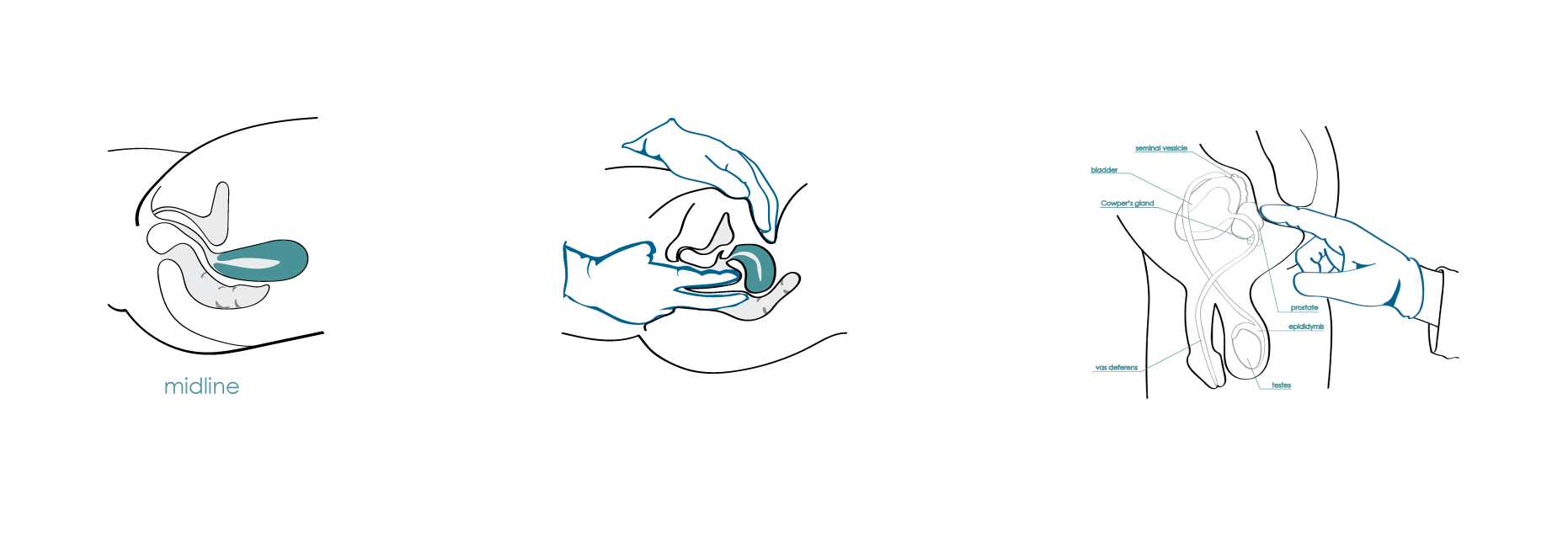
Some of the illustrations used to teach women's breast and health exams.
The Process
curriculum review | founder interviews | medical research | visual research | sketching/drafting | refining
The Results
The initial medical illustrations that came out of this project received high praise from program directors of top medical schools, including requests to match all curriculum illustrations to this new style.
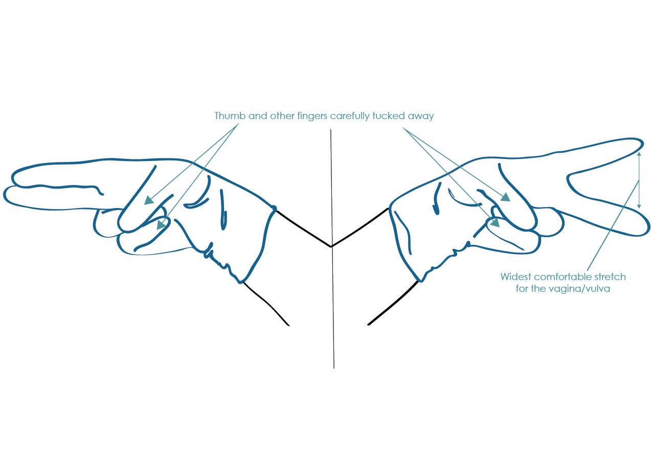
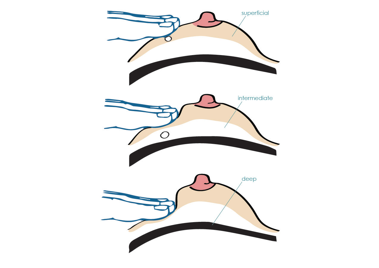
Illustrations of hand positioning to replace previous materials, which were a mix of photos and overly complex, black-and-white vectors.
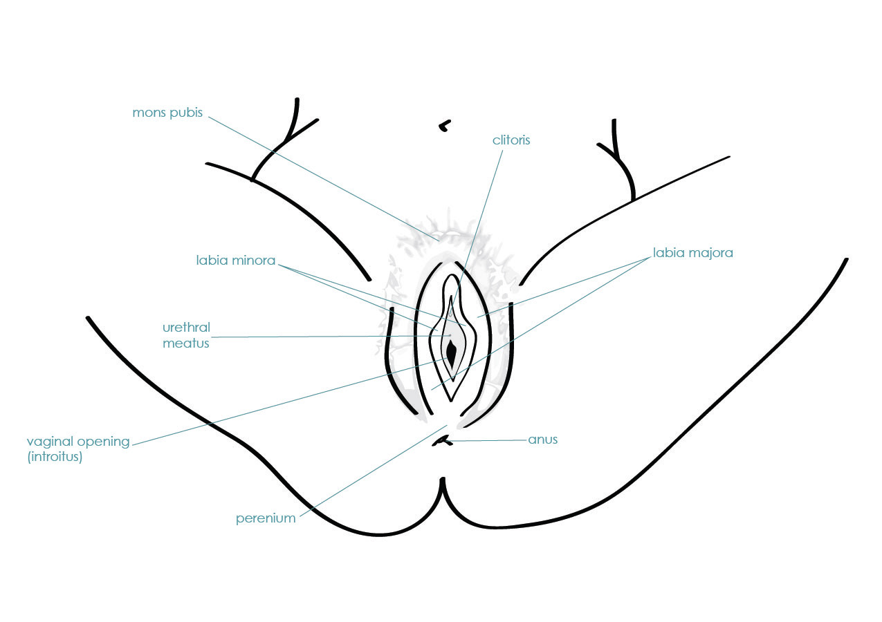
Simplified and clarified anatomical drawings, making the materials useful for medical professionals yet accessible to community members.
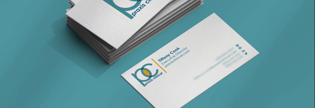
The logo, conceptually hinting at the idea of praxis while hinting at the company's yonic beginnings
Limited use of non-brand colours, when needed to enhance certain elements of the illustrations.
Last Words
Need help making sure you’re sharing your expertise in the best way for your clients AND your brand? Fill out my inquiry form below and let’s talk.