NDA Client—Medical Industries
DOCUMENT DESIGN | TEMPLATE DESIGN | BRAND VISUAL LANGUAGE EXPANSION
The Client
The Client works within the medical & healthcare field in the USA—my work with them is proprietary and under an NDA, but with their permission I’m able to share an anonymized case study on some of our work together.
In their specific area of the US-based healthcare industry, much of their client-facing work is still analog. In anticipation of the launch of a new service, my client wanted to improve the way they liaised with their customers—creating forms and documents that were on brand, streamlined, and easy to use.
The Problem
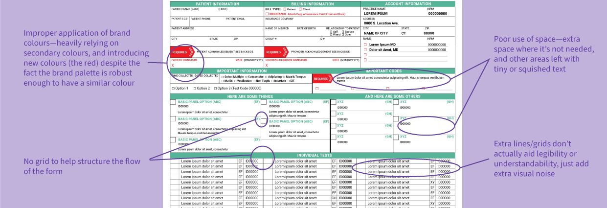
Prior to our work together, my client’s main customer touchpoints and materials—a type of form with 20+ unique variations—had been thrown together as they could make them, lacking structure and consistency and generally creating a confusing & unprofessional experience when it came to their customers actually engaging with the materials. When my client in turn had to gather information from the forms, the process could be slow and arduous as each form presented information differently, included necessary information in different places, etc.
My Role
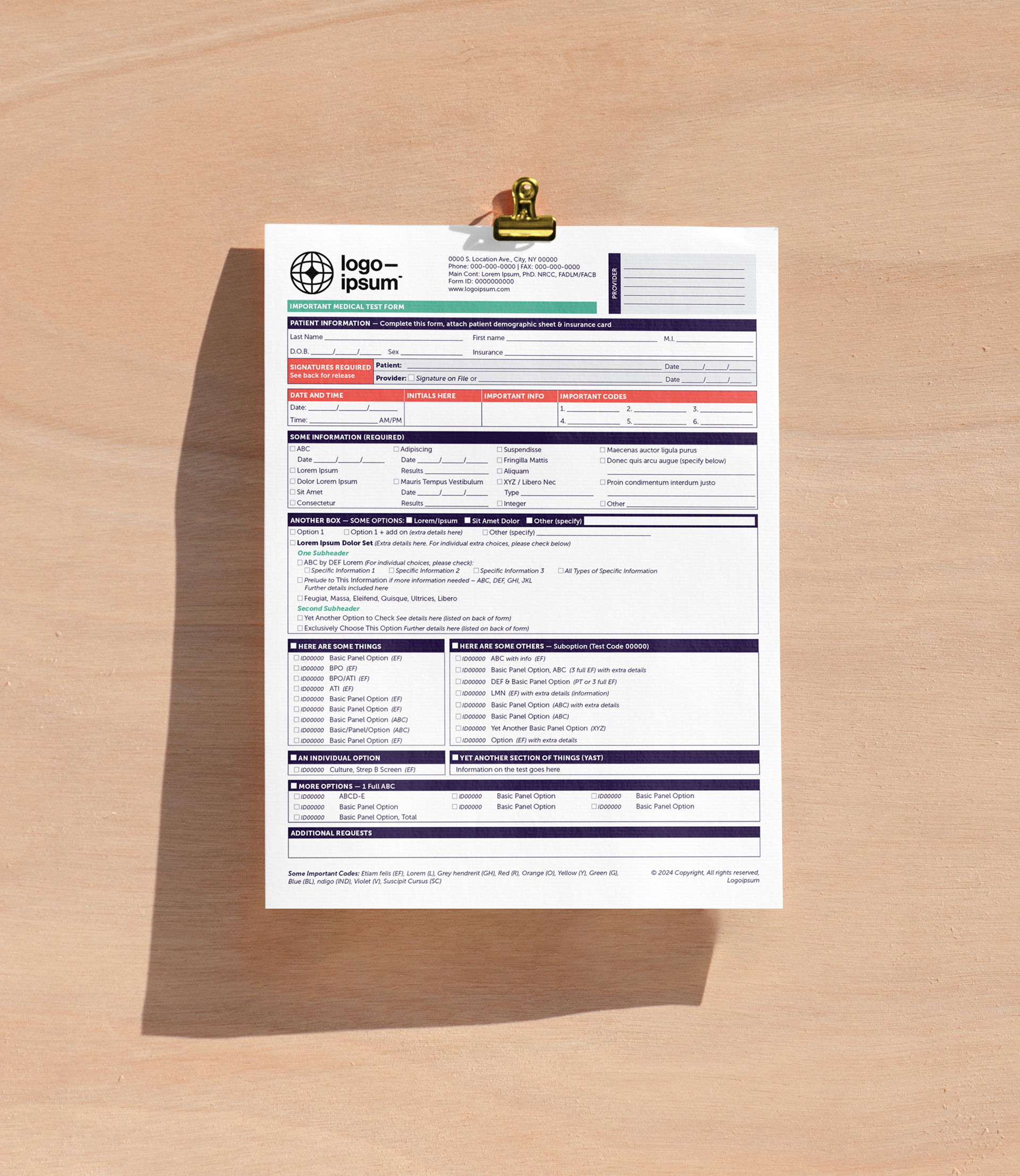
I came on as a template designer, hired for my InDesign expertise and my background working with medical and scientific clients—making me uniquely prepared to grasp the medical technicalities that would in part dictate how the forms needed to be redesigned. The first part of the project required the creation of a totally new form for a totally new product, with that form’s format later being used to recreate the old, confusing materials.
The Solution
The solution didn’t come just from understanding the project technicalities and medical jargon, but also needed to address a weakness in my clients branding and how it was previously being applied to assets. They needed their branded elements—colours, fonts, icons, etc— to create a more clear and functional hierarchy of information. Further, the new branded form rules needed to be adaptive for a wide variety of products & content. This wasn’t one-size-fits-all; each unique form required highly specialized treatment and application of the rules.

The baseline structure and text rules keep consistency across varied information and form types.
The Process
Client walk through/user interviews | market research | visual research | design | refining for use as template | SOP development
The Results
We started with the design of one form, relating to a new product being launched, and I subsequently built out a system for applying the company’s branding to this range of assets. After discussion with some of the primary users for this form, I developed a system/logic for including all the technical information needed, and design rules for different types of information needed on the forms.
The result was a new visual language to use across all these assets—logical and consistent systems for presenting the same type of information across different variants so customers can become used to my clients’ specific way of working, design rules to keep the assets functional for real-world use and on-brand for my client, and a hierarchy of how and when to bend those rules so assets remain consistent despite the wide range of information types, lengths, etc., being presented.
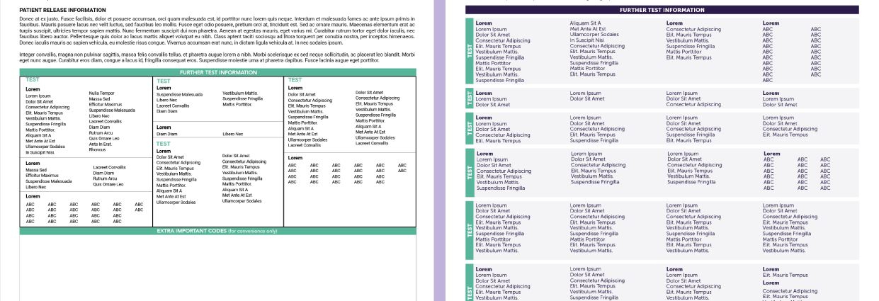
On the left, the old form back. On the right, the new. This vital information was previously shoved into an unnecessarily small area, with another inconsistent grid making it hard to scan for the correct information. In the updated forms, this vital information is more easily scanble—and consistent in its presentation across forms.
Key Takeaways
Understanding the functionality of the assets for my client and their customers, and being able to create strong yet flexible design rules to support that functionality is what has made this project a success. The proper initial analysis and user interviews helped me build an initial base—a responsive layout grid, rules for applying branding, Styles within InDesign, a robust template—that has proved consistent but variable enough to support a dozen more unique asset designs. Without that initial understanding, though, the final products would not have been able to remain so quality and consistent.
Last Words
If you're ready to get your branding & key assets on track, created to empower you to properly employ your brand, fill out my inquiry form below.