Henosis
Branding | Document Design | Design SOP Development
The Client
Henosis is a new interdisciplinary, peer-reviewed, Open Access journal—a modern day agora where scholars across the humanities and the globe meet.
The Problem
Founders Dr. Ed Teggin & Dr. Valerio Alstofi came to me with one initial problem: they wanted to set themselves apart in the market by making sure their articles look as professional and high-quality as the research contained within (uncommon amongst small Open Access publishers).

My Role
I came in as their brand & template designer, as well as an expert InDesign educator to help teach them the skills they’d need to format their early articles.
The Solution
The solution was three-pronged: first, develop branding that reflected the journal’s unique place in the market.

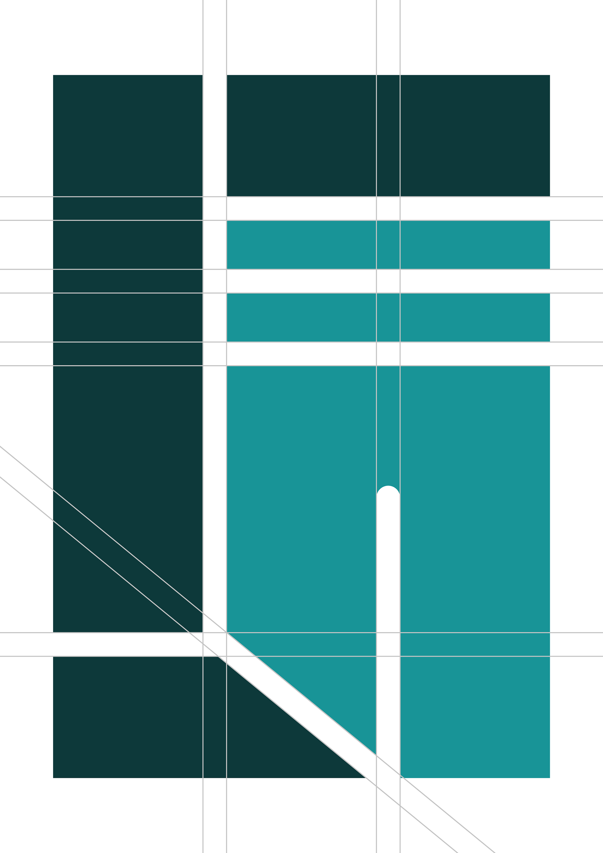
Henosis' logo, built to work as part of a mosaic pattern—a visual representation of the journal's mission & vision of seamlessly weaving together ideas across disciplines.
Second, design an article template that looks high quality & on-brand—something the publishing academics would “feel proud to show off”, which repeatedly came up as a pain point amongst academics publishing with other small journals.

The title page of the final article template, in Henosis Teal.
Third, refine the template and create supporting SOPs to make using it foolproof for the Henosis team with its limited InDesign experience… but robust enough to allow for all the intricate formatting necessities of academic publishing.
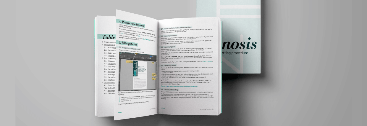
The final procedure document, created in line with Henosis' branding, gives a detailed walkthrough of the article typesetting process.
Branding
The Process
Client interviews & market analysis | visual research | ideation | design | feedback | Revisions | hand-off
The Results
We started with branding, developing a logo and supporting brand elements that spoke to Henosis’ historical basis alongside its modern approach to publication—as well as the importance it places on the quality articles it publishes.
Key features & concepts:
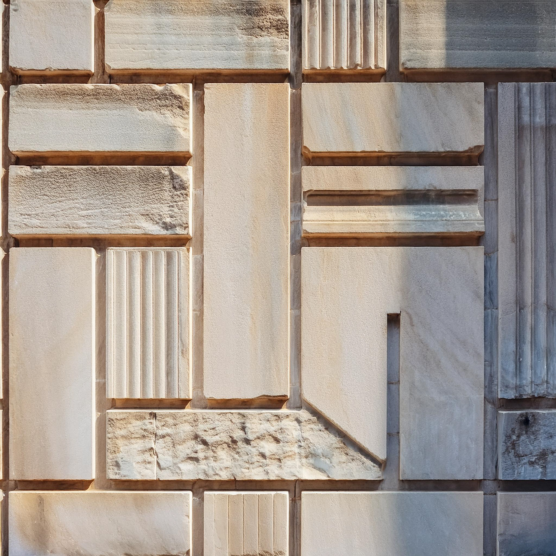
Logo built on Ancient Greek inspiration for the journal’s name, referencing the columns that held up ancient agoras. Clean, modern lines used to marry the ancient inspiration with a XXI Century look
Logo built on Ancient Greek inspiration for the journal’s name, referencing the columns that held up ancient agoras. Clean, modern lines used to marry the ancient inspiration with a XXI Century look
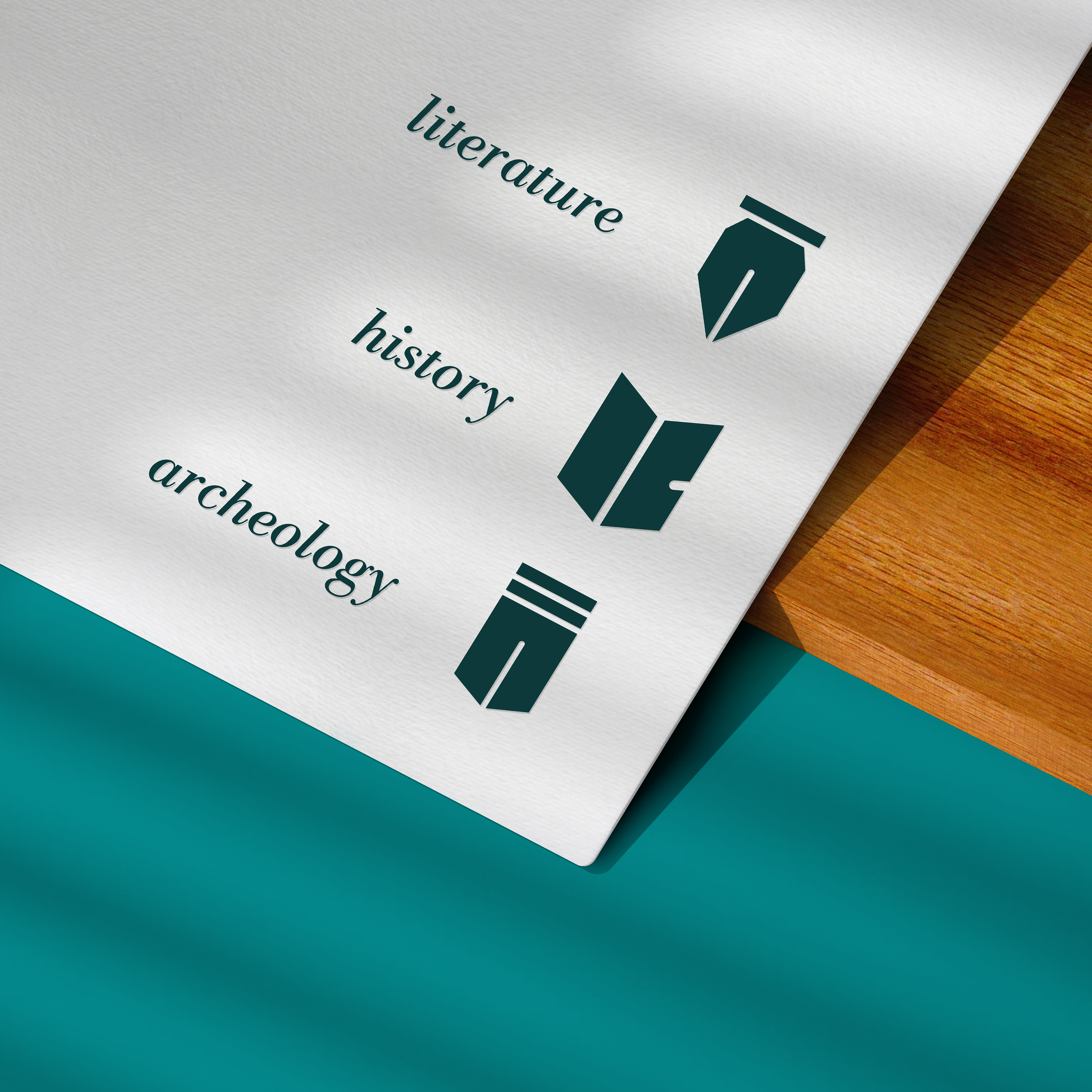
Responsive logo: built to transform into three main icons, each representing one of the journal pillars—literature, history, and archeology
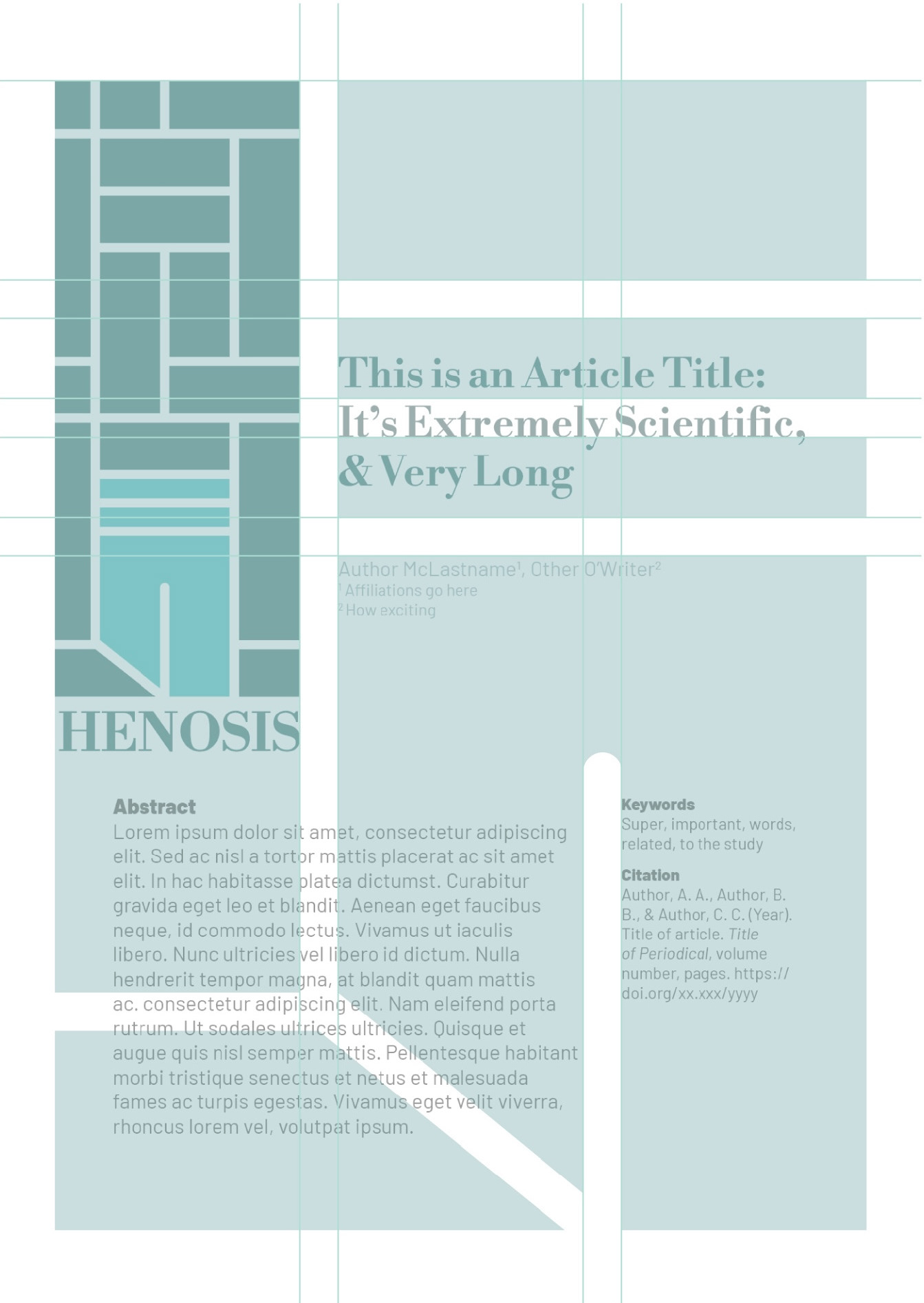
Focus on the article: logo built to scale perfectly to A4 paper, ultimately to be used as a grid guide for the article template itself

For fonts, another mix of old & new, with classic serif Libre Boldoni accompanied by modern Barlow
Article Template Design
The Process
Research: visual & of journal-appropriate articles | ideation | early concept & direction feedback | design | final feedback | formatting & simplifying for use
The Results
As mentioned above, visually the article template cover page was built with a grid provided by the logo itself. Three colour variations are ready for use for specialty section articles, with Henosis Teal as the main template.

The template file itself includes 5 main components:
- Basic “getting started” instructions within the file Slug, which are complemented by & expanded upon in the supporting SOPs
- A properly formatted, complete title page
- A properly formatted body page including examples of most main paragraph, table, character, and figure styles
- Parent pages for title page, as well as vertical and horizontal body pages
- Paragraph, Character, Table, and Cell styles—clearly titled and, where relevant, organized into subfolders and grouped by where they are to be used.
Supporting Template SOPs & Education
The Process
Initial draft | test formatting, documented | marrying the two | branding and creating final document | final walkthrough | client education | resource delivery
The Results
The SOPs to support the INDD template had to be carefully built and clearly written to empower the founders to format and publish their first articles easily and with the desired professional, finished look. The client received a walkthrough on how to use the template, a supporting video as an easy refresher whenever needed, and a 10 page procedure document that walks through the article formatting process from creating the new file through exporting it for publication.
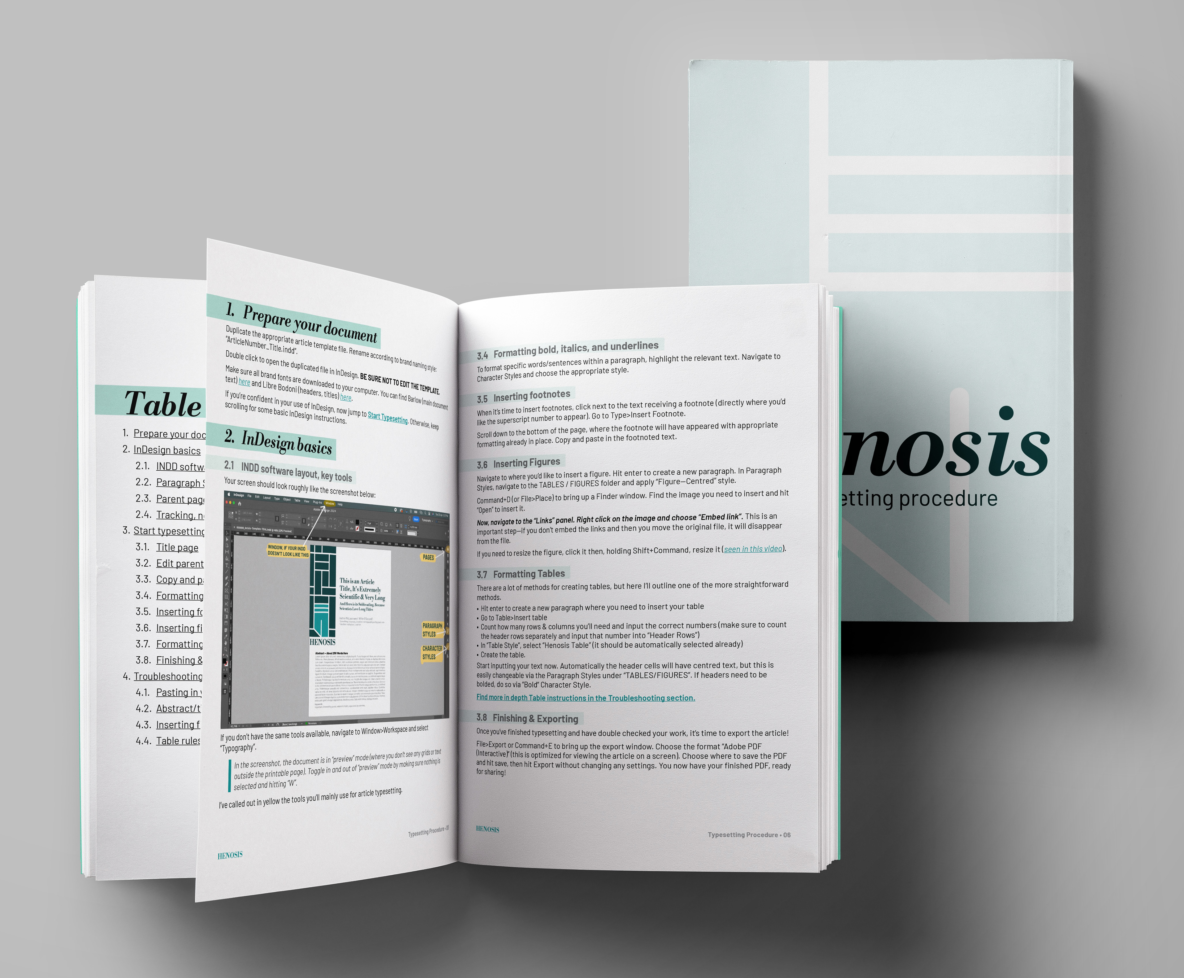
The 10 page document is on brand in its own formatting, includes detailed screenshots of InDesign showcasing what the process will look like with the template itself open in the program, and a responsive Table of Contents so users can jump to whichever section is relevant to their formatting concerns and questions.
Key Takeaways
For all that design is a creative venture, at the end of the day it’s only successful when supported by concepts, rules, structures, and replicability—presented in ways that brand owners can engage with and employ.
Without clear structures, styles, and repeatable rules a brand image loses its potency and quality—and when the brand is new and can’t yet rely on design professionals to maintain said image, it’s vital that the branding designer empowers the brand owners to do so independently.
Last Words
From building a mission & vision-aligned brand identity, to creating brand assets that empower the founders to maintain their image in the early stages of company launch and growth, it was an absolute pleasure to partner with Henosis and its founders.
If you're ready to get your branding & key assets on track, created to empower you to properly employ your brand, fill out my inquiry form below.